
Hardware is where constraints become visible.
Eight years across five thermostat products and connected sensing devices, from fixed-segment displays to touchscreens, built for contractors, DIY homeowners, and hotel guests. Every product failed in its own way, and all of them still had to feel like one family. Hardware taught me that coherence isn't styling; it's judgment, one call at a time.
Patents
Award
Photo 1 of 5
The screen changed. The experience had to change with it.
I joined in 2018, a couple years before Touch 2 started. Touch 1 had already shipped, so there was enough time to get an honest read before touch 2 kicked off. I'd lived with it for a while before Touch 2 kicked off, long enough to know the honest read: Touch 1 had good bones. Its menu structure worked. So instead of rebuilding it, I built on it: kept the structure intact and simplified everything underneath, trimming each screen down to one or two things a user could do there.
That simplification is what made the action button work. Once a screen asked one or two things of someone, with a single button in the same spot every time it could carry whatever mattered most there: Save, Help on a screen with more settings, Connect, Forget Network. People learned where to look once, and it held everywhere.
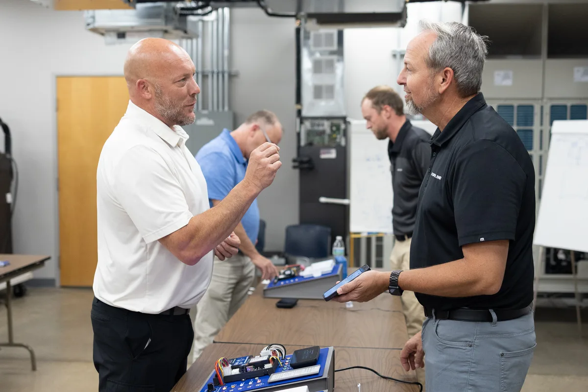
My role put me between product stakeholders, engineering, and developers, I was in a great place to bring collaborative system thinking to optimize the experience for the user.
Pro Tool Reviews called it "possibly one of (if not THE) thinnest models on the market" and said it "doesn't clutter the screen." Neither that review nor the Editor's Choice writeup had much to say about the interface at all. That was the point.
Fan mode and system mode used to live in separate menus, but people almost always changed both at once. So I merged them into a single button showing both states at a glance: heat, cool, auto, aux, or off for the system, and on, auto, or circulate for the fan. As a side effect, adjusting one setting showed users where the other one lived, teaching navigation just by using it. The off state uses a square inside a circle, lifted from the media stop symbol, one of the icons that came out of that round of testing and carried into later products.
The design problem wasn't digital. It was physical.
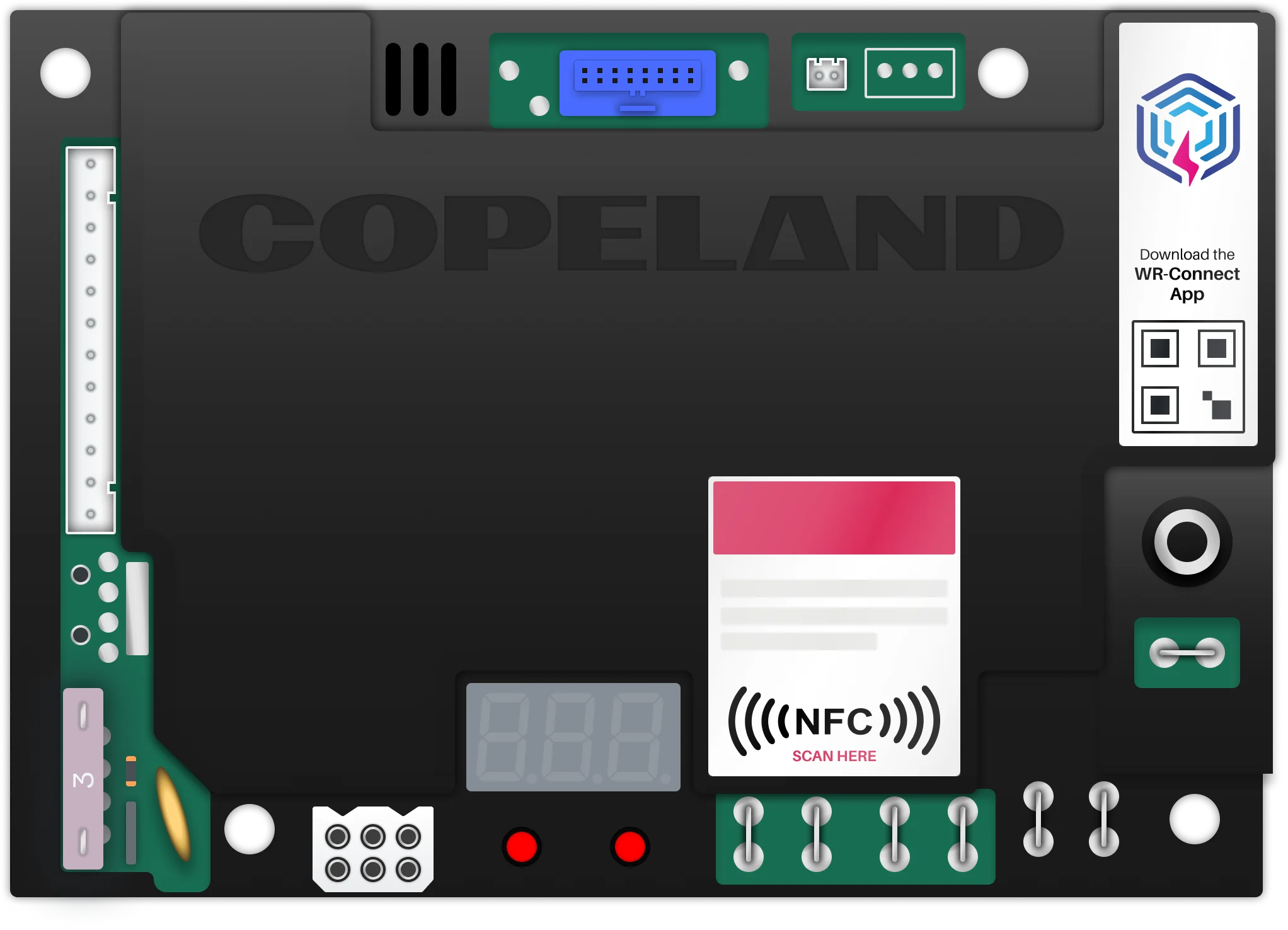
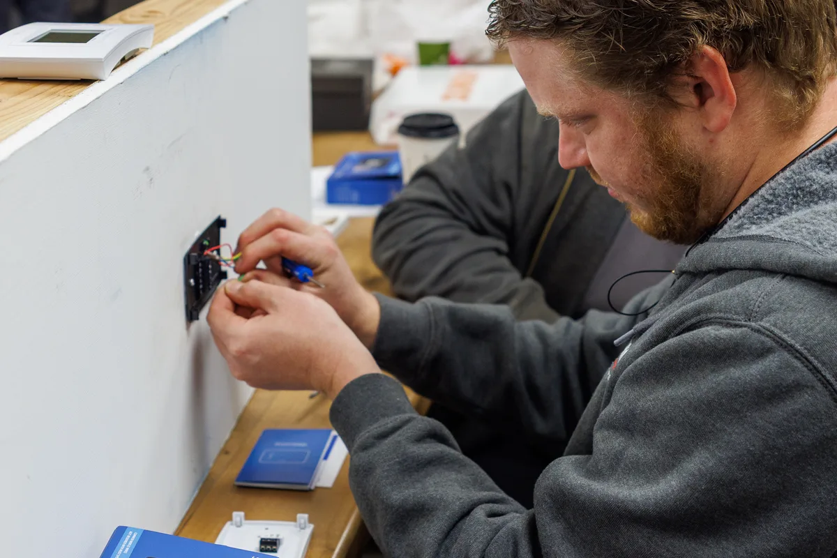
The Equipment Interface Module bridges thermostats to HVAC equipment on installs where the existing wiring can't carry what the system needs. Competitors cover that range with three separate modules. The Sensi EIM covers it with one. The default assumption was that setup happened at the equipment, which meant trips back and forth between the thermostat and the unit, often through a cramped mechanical space, on time a contractor can't bill for. So I moved configuration to the thermostat. The contractor pairs the two devices, sets equipment type and location once, and the EIM configures itself. No back and forth.
On the post-launch distributor roadshow, contractors at two separate stops said almost the same thing without prompting: they liked not having to walk back and forth to press buttons. Contractors are loud when something doesn't work, so hearing the same unprompted praise twice, independently, carries real weight.
"Really liked the pairing process, the ability to wrap up in an area and not needing to go back and forth to press buttons was appreciated." Two different training stops, almost word for word.
A multi-city distributor tour, Cincinnati, Indianapolis, Chicago, Michigan, Texas, put the EIM directly in front of roughly 90 contractors and distributor reps. One stop in Texas placed a purchase order on the spot and started displaying the EIM at their front counter.


Thirty-two segments, three buttons, nowhere to hide.
Sensi Lite is the most constrained product I've worked on. Thirty-two display segments, three buttons, and a brief for a complete thermostat experience that still had to feel premium. With three inputs, hierarchy is too expensive, so navigation stays flat and cyclical. The menu button does different jobs depending on how you press it: a normal press advances, a long press opens homeowner settings, a second long press reaches contractor config. That keeps the settings that can break an HVAC system within reach for installers and out of the way for everyone else. When order does the work a menu usually would, sequencing matters, so I ordered settings by dependency. Heat-pump setup leads straight into reversing-valve direction, most common config first.
Thirty-two segments doesn't leave room for icons, so every label has to earn its space. "OFF" is one of the words I leaned on hardest: short enough to fit, plain enough to read at a glance, and flexible enough to reuse across different screens instead of needing a dedicated symbol per context.
Sensi Lite also runs on power stolen from the HVAC system. When power drops too low for the display, the device still has to communicate state. I helped work out a prioritized shutdown sequence and a notification flow that pushes state to the phone, so the app stands in when the thermostat can't. That low-power detection method is US Patent 12,608,066.
During testing, people were split on where the menu button should sit relative to the up/down arrows. I raised a mis-tap concern about the option we ended up shipping, but the trade-off favored less engineering risk at the time. Customer service feedback after launch surfaced the same issue. The fix ended up being a firmware adjustment to the capacitive button's debounce and sensitivity, not a layout change. A reasonable call going in doesn't mean it's the right call once real usage data shows up, and it's worth revisiting either way.
Designing for guests who'll never be onboarded.
Verdant serves hospitality: guests who touch the thermostat once, speak different languages, and will never read a help screen. The interface has to land immediately or it's failed. I designed two screens off one shared firmware base at the same time: VX4's primary screen, and a separate iconographic version for the European Line Voltage model. For the European model I dropped text entirely and built the interface out of icons, since no caption bails out a language gap. The character set had to read from across a hotel room, not up close, so I studied existing segment forms, drew ideal numerals in Lato, then overlaid every digit on transparency paper to find which segments always fire together and could be merged. Letters like W and Q are still there, just not as crisp as the rest of the set, one of a few trade-offs for keeping things legible at a distance. Another was going with a single mixed-case alphabet instead of separate upper and lowercase sets, since the segment budget didn't have room for both.
The finalists went through A/B testing on PCB prototypes in a room the size of a hotel room, 15 to 20 feet of viewing distance, with participants who'd never seen the product, under varying light and randomized text. I led the character-set design. The typeface is the subject of a pending US design patent (US 29/952,805).
The wireless sensor protocol I built for Verdant later became Sensi's room-sensor network. Not because the products share an ecosystem, but because the problem was identical and the work already existed. When the same problem shows up twice, reuse beats walling it off by product line.
VX4 and the European Line Voltage model share the same firmware but needed different screens, so I designed both at once instead of treating the European version as an afterthought bolted onto the US design. That's a different skill than starting fresh like the consumer-facing Sensi app: keep two variants coherent within a system you inherited, and leave room for whatever comes next.